
Is The Gallup World Poll Reliable?
The way some researchers use the GWP can explain why they fail to find effects of digital technology on youth mental health

Intro from Zach Rausch and Jon Haidt:
For some time, Jon, Jean Twenge, and I have been engaging in a productive academic debate with a few researchers about the scale of the youth mental health crisis. We argue that the mental health of adolescents—measured by levels of anxiety, depression, and other indicators—began to decline in the early 2010s across the Anglosphere, the Nordic nations, and numerous Western European countries.
Is the decline global, or is it limited to a subset of developed Western nations? In a previous post here at After Babel, Dartmouth economist Danny Blanchflower independently found that young people (ages 18-25) now report worse mental health than all other age groups in 82 countries around the world. In nations where we have long-term data, this was not true before 2015. It used to be that young adults and older adults were the happiest, producing a “U-shaped curve” when you graph happiness by age. (Note that youth suicide rates do vary more across nations and are not the focus of this post. See Zach’s posts on suicide variation here, here, and here.)
Although many researchers now agree that there is a youth mental health crisis in the United States, some argue that this is not a multi-national phenomenon and does not seem to be impacting youth from the developing world in the same way. While we acknowledge some regional and between-country variation (e.g., the changes since 2010 appear strongest in the most wealthy, secular, and individualistic nations), along with within-country variation, data from the developing world has been relatively sparse.
But we are starting to accumulate more data, and we are seeing that young people are reporting worse mental health than all other age groups in nations all over the world. A number of surveys, like the Program for International Student Assessment (PISA) (one of the few that surveys teens), and more recent large-scale surveys, such as The Global Minds Dataset (created in 2019), found declines in many non-Western nations, especially in recent years. (For a overreview of all available global mental health datasets we can find, see here).
At the same time, there is another dataset that does not show these same widespread trends: The Gallup World Poll (GWP).1 This discrepancy between datasets has naturally caused disagreement about what has been happening to young people. For those who rely on the Gallup World Poll, the mental health problems of the young are concentrated in some developed countries. For those who rely on other datasets, mental health problems are worsening on a larger scale. Which surveys are more accurate, and why do they differ so much?
In this post, Dartmouth College economist Danny Blanchflower examines the Gallup World Poll in-depth and identifies four major problems that he believes explain why the GWP finds such different results from other international datasets.
His insights about the Gallup World Poll matter not only for understanding youth mental health around the world but also for the academic studies that rely on the GWP that cast doubt on the idea that the Internet (and social media, in particular) are harming youth mental health.
* Note that we will soon have a Substack post that addresses these three articles directly.
As you will see below, relying on the Gallup World Poll to make these kinds of claims may be a problem.
– Zach and Jon
[Note: Note: You can read a response to Blanchflower from Gallup—and a reply by Blanchflower—in a post published July 3rd, 2024 titled, A Debate on the Strengths, Limitations, Uses and Misuses of the Gallup World Poll]
Evidence of an international decline in the well-being of young people since the early 2010s has been mounting. In the U.S., recent declines in youth mental health ar eevident across various datasets, including the Household Pulse Survey conducted by the Census Bureau, the CDC’s Behavioral Risk Factor Surveillance System (BRFSS), and the National Health Interview Surveys. Additionally, data from the Census Bureau’s Household Pulse Survey indicates that young people experienced the highest incidence of COVID-19 and the worst mental health from 2020 to 2022. These datasets also show that, in the U.S., the youngest adults are now the least happy, while older generations are progressively happier.
Internationally, similar evidence is found across various datasets, including the Global Minds Database and the International Social Survey Program. In a previous Substack post, I demonstrated that these declines have altered the traditional U-shape in happiness and the hump shape in unhappiness (which you can see for the U.S. in the blue and green lines in Figure 1), with young people now being the least happy across all age groups (see the red and yellow lines in Figure 1--the hump shape is gone)

Figure 1. Changes in Despair by Age. Age is on the X-axis; We measure despair as the percentage of respondents reporting 30 days of poor mental health in the last 30 days (depicted on the Y-axis). Source: Behavioral Risk Factor Surveillance System (BRFSS) surveys.
However, one dataset stands out for seeming to contradict this finding: the Gallup World Poll (GWP). The GWP is a publicly available individual-level survey that has been conducted since 2005 and currently includes data from 168 countries. It has been used by several researchers to examine well-being, along with a couple of my own papers on the midlife crisis.
However, upon shifting my focus to the well-being of the young, I have identified several major issues with using the Gallup World Poll to examine well-being. This has led me to conclude that the GWP is unreliable for understanding global mental health trends nor its relationship with digital media use, especially when breaking results down by sub-groups and sub-regions (e.g., young men or women in South America). In this post, I will discuss four primary concerns with the GWP and the broad implications that come along with them.
The four, in brief:
Samples are small, especially for large countries, and do not appear to be nationally representative.
The survey’s well-being measures did not decline during the Great Recession or COVID-19, which seems unlikely to reflect reality, given that most other surveys show declines.
The timing of the survey varies by month within and between countries.
The GWP shows that internet “access” is positively correlated with well-being, but the survey does not ask about the intensity of use, which is what matters.
Taken together, these problems cast doubt on the validity of the Gallup World Poll results and studies that rely on this dataset to measure the impact of the internet or social media on the well-being of the young, or the old for that matter.
Here are those four concerns in longer form.
1. Samples are small, especially for large countries, and do not appear to be nationally representative
From 2005 to 2023, the Gallup World Poll (GWP) sampled 168 countries with a total sample size of 2,734,564. Although this may seem like a large and representative sample, problems with the dataset become evident upon closer inspection. Notably, the sample size in large and small countries is not significantly different. For example, between 2005 and 2022, there were 15,097 observations in Malta (population 0.5 million in 2024), 15,684 in Cyprus (1.3 million), 17,271 in Kosovo (1.9 million), and 20,507 in the United States (340 million).
In the years 2020-2023, there were 4,020 observations for the entire U.S., with only 319 of those under the age of 25. Breaking it down by year, only 33 young women were surveyed in 2021 and 69 in 2022. This is too small a sample upon which to claim anything about trends facing American youth. (In contrast, the Behavioral Risk Factor Surveillance System (BRFFS) surveys 350,000+ Americans annually).
Table 1. Total # of young women aged 15-25 (2010, 2015, 2020-2022) in twelve countries

Does this impact the validity of the results? Yes. We can check the quality of one of these samples—the U.S.—and compare it with a much larger sample for the U.S., also surveyed by Gallup, with exactly the same variables and years as the GWP. The results are very different. In other words, the GWP does not appear to be nationally representative when compared to a much larger survey by the same company.
I took the microdata from Gallup’s U.S. Daily Tracker (USDT) for the period 2008-2017 (n=3,530,270) and also the microdata from the GWP for the United States (n=12,231). We examined the most used measure of well-being in the GWP—Cantril’s ladder, which was also used in Gallup’s U.S. Daily Tracker.
Q1. Please imagine a ladder with steps numbered from zero at the bottom to ten at the top. Suppose we say that the top of the ladder represents the best possible life for you and the bottom of the ladder represents the worst possible life for you. If the top step is 10 and the bottom step is 0, on which step of the ladder do you feel you personally stand at the present time?
The first thing to note is that both the average Cantril (life satisfaction) scores for each year and the direction of change over time between the two datasets did not correspond with one another.
To get a sense of just how different the results from the two datasets are, we can compare how the scores from U.S. states compare against each other, as Figure 2 shows. If the surveys were consistent, all the data points would be on the 45-degree line, but they are far from it (the R-squared is only 0.08).
For example, Hawaii ranks #1 on the Daily Tracker but #26 on the GWP. Conversely, West Virginia, which ranks 51st on the Daily Tracker, ranks 15th on the GWP.
State Cantril Rankings: Gallup World Poll vs. U.S. Daily Tracker
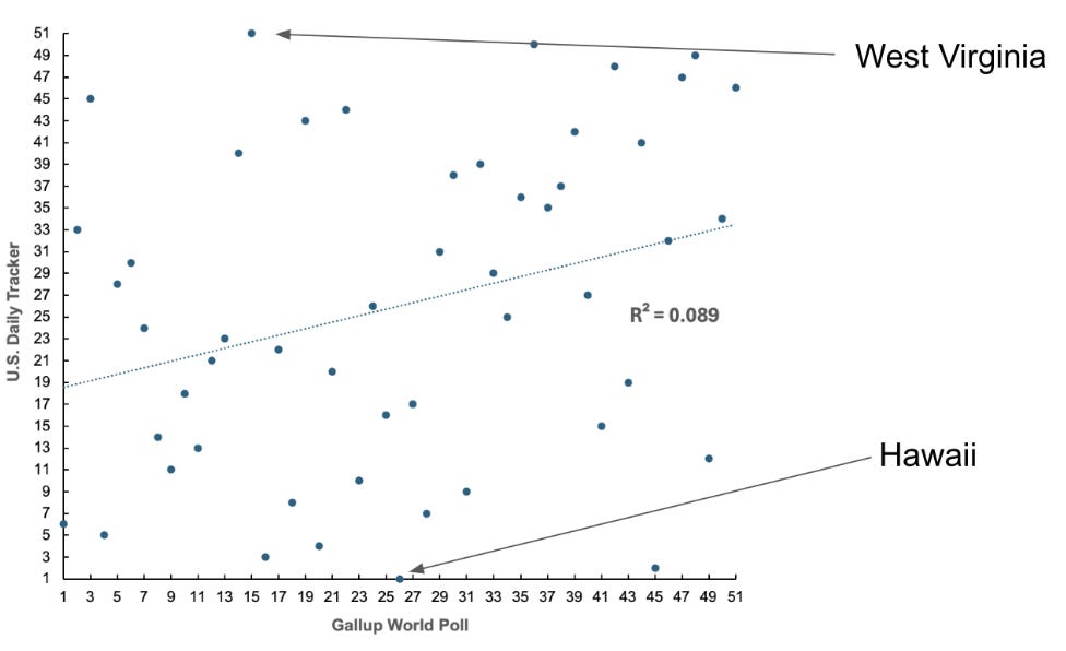
Figure 2. Comparing U.S. state Cantril rankings between the Gallup World Poll and the U.S. Daily Tracker.
In sum: The GWP does not seem to be nationally representative. If the results are not representative in the United States, this casts doubt on the representativeness of all other GWP countries, where we do not have an equivalent of the Daily Tracker. We have no idea how representative the small surveys in the GWP are for other large countries, including France, Germany, Italy, China, India, the UK, Indonesia, Pakistan, and Brazil, or any other country for that matter.
2. The survey’s well-being measures did not decline during the Great Recession or COVID-19, which seems unlikely to reflect reality, given that most other surveys show declines.
In a previous paper, my research partner Alex Bryson and I examined how the GWP data for Europe was impacted by two major shocks: the Great Recession (2008-2009) and COVID-19 (2020-2022).
Surprisingly, Cantril's life satisfaction measure, administered as part of the GWP dropped between 2006 and 2007, the years preceding the Great Recession, only to rise in 2008 before falling again in 2009 and 2010. This pattern suggested that people became more satisfied with life during the Great Recession, which strains credulity.
We observed similar unexpected trends during the COVID-19 pandemic. Cantril's life satisfaction scores, according to the GWP, rose in 2019 and 2020, coinciding with the onset of the pandemic, and increased further in 2021. Also note that the binary well-being items in the GWP for Europe, such as enjoyment, pain, smiling, sadness, anger, and worry, showed little to no change in response to these significant shocks. This seems unlikely.
These findings contrast sharply with evidence from almost all other available surveys, including the European Social Survey, Eurobarometer, and the IPSOS Happiness Survey (2018-2023) reported in Blanchflower and Bryson (forthcoming article in Plos One). These surveys typically show declines in well-being during these two crises.
Why do the GWP findings differ so significantly from other surveys?
3. The timing of the survey varies by month within and between countries.
A major problem with the GWP survey is its inconsistent timing, which partly explains the lack of decline in various well-being measures in response to shocks like the Great Recession and COVID-19. The GWP collects data in different countries at different times of the year, and this timing varies annually.
For example, within countries, the GWP collected data in India in July 2008 but not again until November 2009. Between countries, the timing also varied: in 2008, the U.S. sample was drawn in August, the Indian sample in July, and the Spanish sample in April. In 2009, the samples were drawn in July, November, and April, respectively. (Table 1 shows the dates of data collection for the three countries: the USA, India, and Spain)
Table 1. Sampling dates in the U.S., India, and Spain

This irregular timing means that some of the impacts of significant events, like the Financial Crisis, were missed in some countries. Additionally, the timing of data collection can affect well-being measures due to seasonal variations. As research has shown, seasons significantly influence well-being. Collecting data in the middle of winter versus the middle of summer can yield very different results.
4. The GWP shows that internet “access” is positively correlated with well-being, but the survey does not ask about the intensity of use, which is what matters.
In three widely discussed papers, Vuorre and Przybylski (2023a, 2023b, 2024) examined well-being in the GWP using Cantril’s life satisfaction measure and several binary variables, including pain, worry, sadness, stress, anger, smiling, laughing, and enjoyment (e.g., Did you smile or laugh a lot yesterday, yes or no? or Did you experience the following feelings during a lot of the day yesterday? How about worry? yes or no). All three papers found—on the whole—that gaining access to the internet, mobile phones, or Facebook had little or no harmful effect on people’s well-being and that there were even some signs of benefits. (Note that one of the studies did show some signs of worsening effects for young women.)
All three papers are plagued by the issues of the GWP that I have discussed in this essay: unrepresentative and small samples (especially when breaking down by age, region, and sex), inconsistent findings compared with other representative datasets, and sampling methodology that lead to a number of strange findings (sampling before the recession began and then after, and thus missing any change in well-being during the financial crisis).
It should be said that the three papers are also very hard to make sense of. For example, Figure 1 in Vuorre and Przybylski (2023a) has 22 separate boxes, sixteen of which have about a hundred lines plotted in each tiny box. Figure 2 of that paper has six columns and around a hundred rows, all of which are difficult to read, with several hundred uninterpretable squiggly lines in each column. Figures 1 (with 20 boxes), Figure 2 (9 boxes), and Figure 3 (with 40 boxes plus eight empty ones) and many lines too small to see. Vuorre and Przybylski (2023b) and Vuorre and Przybylski (2024) have the same issues. To illustrate, see this figure from Vuorre and Przybylski (2023a) showing the mean responses of 72 countries on three GWP well-being measures:

Figure 3. Figure A and B from Vuorre and Przybylski (2023a). “72 countries’ mean responses to three well-being scales in the Gallup World Poll from 2008 to 2019, separated by age category and sex.”
Some of the papers also suffer from additional issues with additional variables. In one, they found that access to the internet at home and using the internet in the past seven days are positively correlated with well-being and negatively correlated with ill-being. I replicated these findings, confirming that internet access variables are positively correlated with well-being.2 But what does this really mean? What Vuorre and Przybylski have shown is that developed countries with almost 100% access to the Internet are happier than developing countries with less access. That, in my view, tells us nothing about the impact of internet and smartphone usage on the well-being of the young. I outline my reasons below.
I examined these data and focused on one of the variables used (wp15862), which measures whether the respondent used the internet in the last 7 days and is available every year from 2015-2022 (n=813,776). This variable has a mean of 91% across all countries. In developed nations, it is substantially higher. In the U.S., Netherlands, Lebanon, Saudi Arabia, UK, Canada, Belgium, Spain, Italy, Czechia, Sweden, Denmark, Hong Kong, Israel, Vietnam, Thailand, New Zealand, South Korea, Austria, Bahrain, Estonia, Ireland, Luxembourg, UAE, and Norway, the mean access rate is over 95%. In other words, in developed countries, there’s just not much variance, so it will be difficult for that variable to correlate substantially with anything.3
In the U.S. GWP sample, just 133 people did not use the Internet in the prior week between 2020 and 2022. Among young people, none of the 313 individuals under the age of 25 had not used the Internet. Nobody. Most non-users are over 65 with low incomes.
To further illustrate this problem, I examined how many females under age 25 did not use the internet in the last seven days. In total, 7% of women (2,693 out of 38,710) did not use the internet between 2020-2023. Notably, there are 38 countries with five observations or fewer, including: Albania (2); Armenia (2); Austria (3); Azerbaijan (1); Bosnia and Herzegovina (1); Brazil (2); Costa Rica (5); Cyprus (2); Denmark (1); Georgia (3); Greece (1); Hong Kong (2); Iceland (1); Ireland (3); Jamaica (3); Jordan (4); Kazakhstan (4); Kyrgyzstan (4); Lithuania (2); Luxembourg (2); Malta (1); Moldova (1); North Macedonia (1); Northern Cyprus (4); Poland(1); Puerto Rico(1); Singapore (1); Slovakia (2); South Korea (2); Spain(1); Switzerland (1); Thailand (1); Turkey (1); Ukraine (1); United Kingdom ( 3); Uruguay (3); USA (0) and Vietnam (1). When there is no data, it is essentially impossible to produce reliable estimates.
This matters for the analyses of Vuorre and Przybylski because this variable is clearly a poor indicator of how much internet usage impacts well-being. There is no variation in the data, and hence, these are entirely inappropriate measures to examine the impact of the digital age on well-being and, especially, youth well-being. Essentially, all the authors have identified is that the 95% of people who used the internet the prior week are happier than the 5% who didn’t.
Conclusion
In my view, the Gallup World Poll (GWP) is too unreliable for making sense of global mental health trends. It has significant issues related to sample size, especially for large countries like the United States, which have similar sample sizes to those from small countries like Malta. I found little resemblance between the well-being findings from the U.S. GWP file and a much larger file with the same questions and years (2008-2017).
In many countries, sample sizes are extremely small, making it difficult to identify any separate effect for young people in general and young women in particular.
The questions used in the GWP, including Cantril’s ladder, which refers to life satisfaction as an integral measure of the past, do not respond to major macro shocks like COVID-19 and the Great Recession.
The fact that the GWP doesn’t show the declining well-being of the young over the last decade or so outside of the developed world does not mean that this decline isn’t happening. The decline in the well-being of the young means that mental health now improves with age. These trends are clear in better datasets such as Global Minds and others in Australia, the UK, the USA, France, Germany, Spain, Sweden, New Zealand, and Italy, which have better sample designs.
All of this is to say: The Gallup World Poll is an unreliable dataset for understanding global well-being. From the World Happiness Report, which relies on the GWP, to the three studies by Vuorre and Przybylski that depend heavily on this data, the findings should be taken with a big pinch of salt.
Note that the GWP did show declines among young people in life satisfaction in the Anglosphere and some Western European nations. Also note that there is another regularly used dataset--the Global Burden of Disease (GBD)--but this is not actual data. This dataset has been used to show little change in youth mental health in the United States. The GBD is a set of estimates of what health data might be, based on other variables. Zach has shown in a previous post why the GBD is unreliable, as it does not reflect the most reliable population mental health trends we have available.
This can simply be done by running a life satisfaction regression with internet usage as a right hand side variable by country with or without controls, say for gender, age, education and labor force status perhaps. These can be done by country which is much easier to report.
The weighted percent of respondents by country who said they used the internet in the past week. 68 countries had 95% or higher usage. Individuals who did not have this usage tended to be African countries that had below 70% usage – Uganda, Zimbabwe, Chad, Burkina Faso, Niger, Tanzania, Ethiopia, Malawi and Madagascar, the old, low income earners, and the less educated and in the sample of pooled years, who were sampled at the beginning year such as 2015 rather than more recently. In 2022 coverage was 100% in Kuwait, 99.6% in Taiwan and 99.3% in Sweden.
 | A guest post by
|
Thank you again for all of your advocacy and research. Last week, our school district announced a district-wide ban on cell phone use for all middle and high schools. Your book was linked as a reference in the initial survey sent to parents.
In “These Truths: A History of the United States” by Jill Lepore, the Gallup Poll was made by by a White American Male in the Mid 1930s to measure American Public Opinion. The same systems are largely used today. 😅
“[George] Gallup liked to call public opinion measurement ‘a new field of journalism,’ ” Lepore writes. He believed he was taking the “pulse of democracy.” E. B. White, on the other hand, writes that “although you can take a nation’s pulse, you can’t be sure that the nation hasn’t just run up a flight of stairs.” Though Lepore is careful to leave her own opining largely out of the narrative, it becomes clear that she rather agrees with White.
Excerpt from Ilana Masad @ https://www.theparisreview.org/blog/2018/09/18/america-doesnt-have-to-be-like-this/
“Gallup’s polls attempted to predict the outcomes of elections, but they were also meant to scientifically represent the opinions of the nation so elected officials could know what the people wanted. But representation was the woeful problem. Although 10 percent of American citizens in the thirties and forties were black, they made up less than 2 percent of survey groups—and only in the North, because Gallup didn’t bother to survey black people in the South, where a variety of methods prevented many from voting. This was selective representation at best. Plus, Gallup’s method implied that his participants already had opinions on the issues at hand, when often these takes were formed on the spot, spawned by the question, for the simple purpose of having a yes or no answer.”
So yes. This article tracks.